
In this front cover it is a visual copy of a magazine cover which has
A colour scheme: A tropical sense of film as the colours represent passion, from the font main title a image of eyes which could be a suggestion of being able to visualise the creativity of the art house genre to be able open your eyes to wider range of film texts which ray you understanding of the film for the niche audience.

Firstly, in this content page you can see the different types of films that would appeal to the niche audience which is because they will be able to get information on the characters, this will then give them and enabling way of finding out more on the characters in the films. This is targeted to on audience who understand the genre well who want more information on the whole plot of the film while finding other film in the same line of appeal.

This cover has some artistic elements that would make it seem quite spontaneous with the use of colour and the actual theme being art house gives this picture artistic. This would also highlight that this is an institution which is based on an art-house cover because of the use of . This would also look to have the logo since this would be seen as quite good.
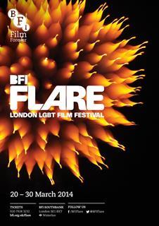
In a majority of "The Flare" covers, these would show an artistic feature that would allow it to look unique. This cover has a black background with a contrast from the picture to make it look quite professional and have the focus point of the cover on the picture where the title is present


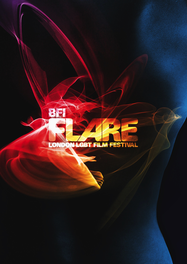
This is another cover that was introduced in the same year as the "BFI Flare" cover which could suggest that the use of a black background and bright text in front makes the visual point the brochure. I could also implement a similar technique with the black background and the contrast to make the text the visually appealing factor of the cover. This cover also states the different institutions that sponsors, the audience of the events can also keep up to date with the firm by following their
This front cover uses simple conventions of a film cover which has no real central image in it but i believe that is meant to be a back inside of the cover photo this is a creates the affect of being more appealing to the audience as they are then going to be to be more engaged into the central image which is because they are going to be concentrating more into the picture this is effective because then the audience are able to identify what cinema this is once engaged with the front cover itself.
No comments:
Post a Comment